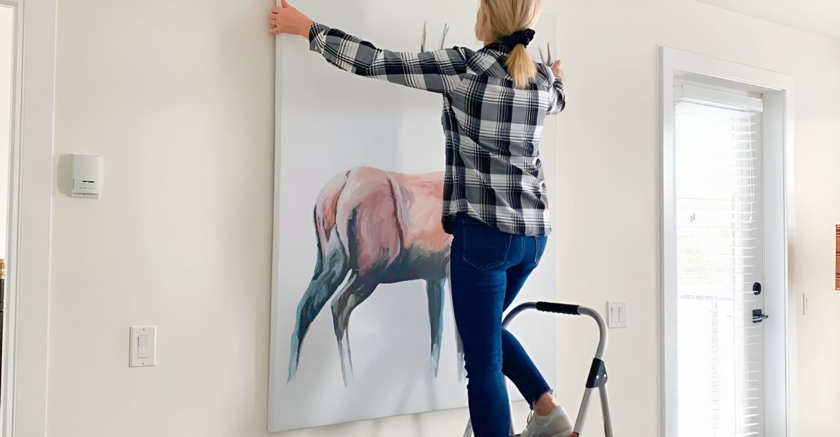
Every home has a story, but sometimes the plot twist is that you’ve committed such a decorating faux pas that even your well-meaning friends won’t tell you about it.
However, interior designers can’t help but spot these “ugly” mistakes when they walk in the door. From furniture pieces that look like they’re lost in a room to lighting that drains the life from your space, these blunders are more common—and easier to fix—than you think.
Let’s pull back the curtain on the 15 biggest and ugliest interior design mistakes that designers likely cringe at, why they matter, and how you can banish them for good.
1. Disregarding Flow: When Routes Become Obstacle Courses
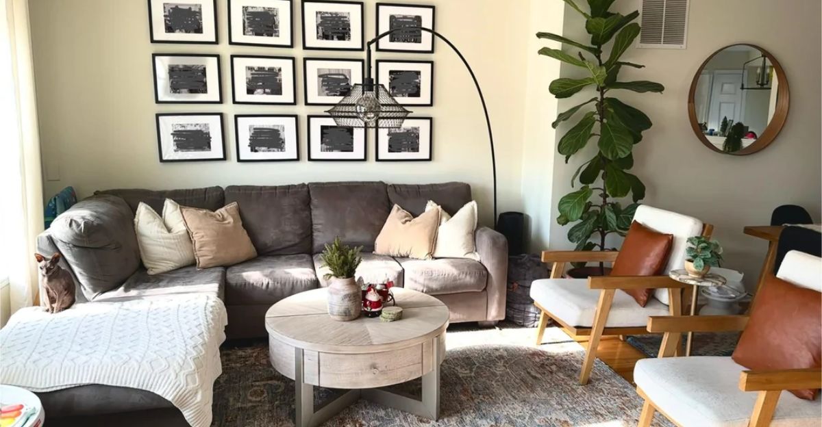
Designers can easily spot a poor layout. When you’re moving around a room and need to dance around coffee tables, chairs, or poorly placed decorations, the flow is broken—and so is the room’s atmosphere.
Good design has obvious, smooth, and natural routes. You can accomplish this by reconfiguring a few pieces to open up the space, making your home feel more welcoming and functional.
2. The “Matching Set” Trap: Why Uniformity Can Feel Lifeless
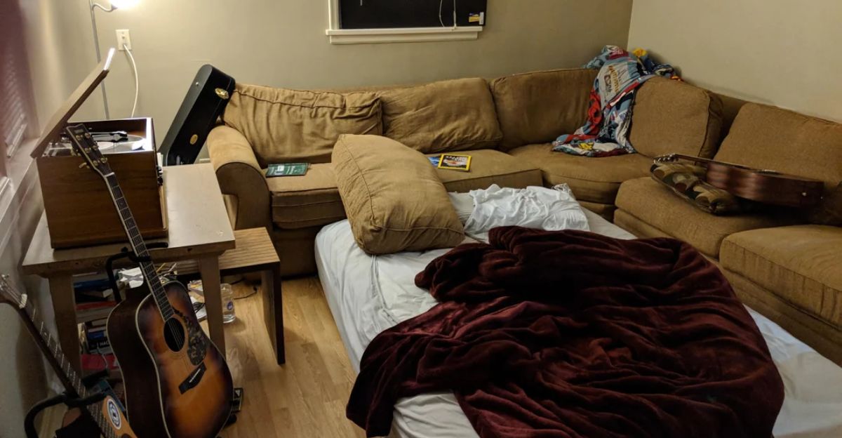
You’d think buying a matching living room set would be foolproof, right? Wrong. Instead, it makes your home look like a showroom instead of a sanctuary.
Too much of the same thing is not a good thing when it comes to interior design, as it kills personality and makes spaces feel flat—no wonder TikTok is full of “before and after” videos where people break up their sets and suddenly, the room breathes again.
3. Over-Accessorizing: When Personality Becomes Clutter
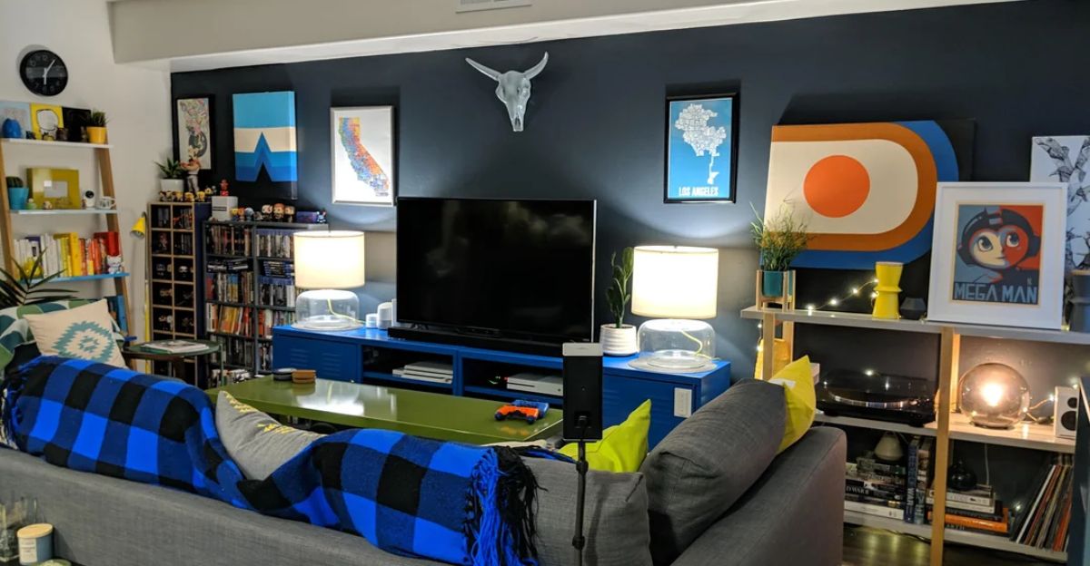
There’s a fine line between curated and cluttered. Over-accessorizing is a classic mistake that instantly translates to messy, not lived-in.
While Instagram feeds may romanticize maximalism, designers warn that too many knick-knacks create stress and visual noise. “Less is very often more,” counsels Gillian Segal. So, edit mercilessly and let your best pieces take center stage.
4. Art at Awkward Heights: Why Your Gallery Wall Doesn’t Feel Right
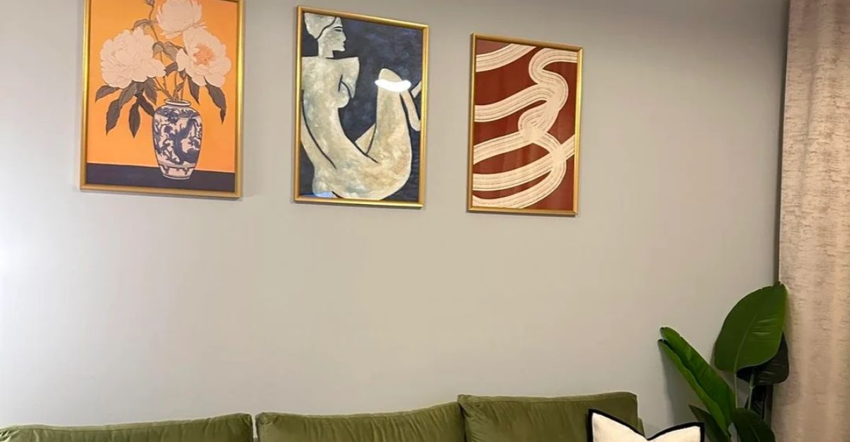
Art hung too high, too low, or in odd clusters on the wall can throw off an entire room’s equilibrium. Designers spot this right away, especially in rooms with ample seating.
The fix? Hang art or photos so their centers are at eye level, about five feet from the floor. It’s a simple tweak that instantly makes your space feel more thoughtful.
5. The Scale Fail: Tiny Rugs, Giant Sofas, and Other Proportion Pitfalls
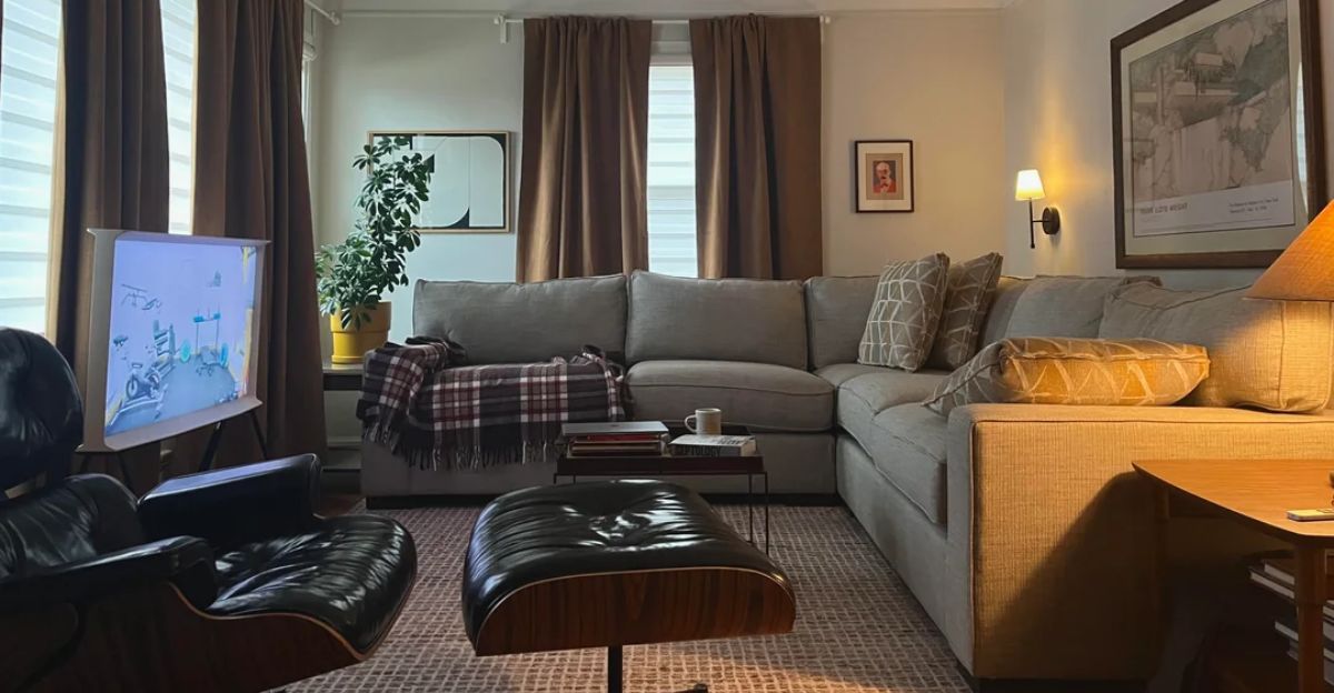
Nothing screams “decorating fail” like a rug island in a large living room or a sofa that dwarfs all the other furniture. Scale and proportion are the magic words that foster good design.
A room with mismatched décor and furniture sizing feels both uncomfortable and incomplete, like the visual equivalent of a pair of shoes three sizes too big.
6. Lighting Letdowns: Why Bad Light Makes Everything Look Worse
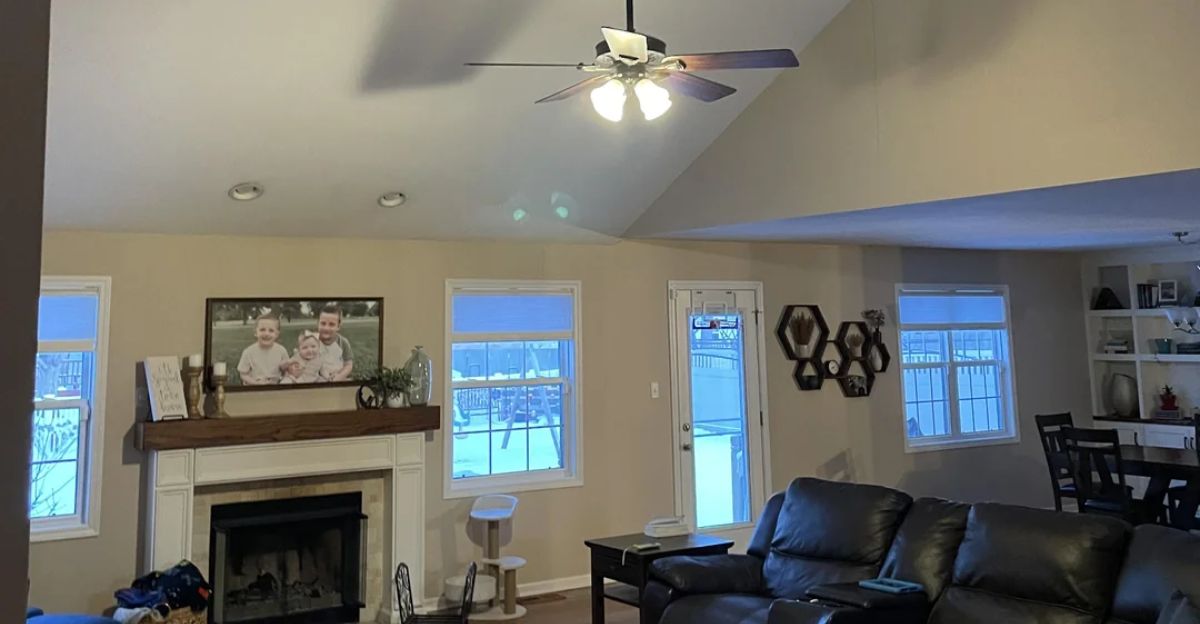
Lighting is everything. Designers cringe when they walk into a room with a single overhead bulb or light temperatures that clash. Bad lighting can flatten even the best décor, whereas layered lighting—lamps, sconces, and dimmers—adds warmth and depth. It’s the fastest way to upgrade your space, short of completely renovating your electrical work.
7. Pushing All the Furniture Against the Walls: The Socially Awkward Layout
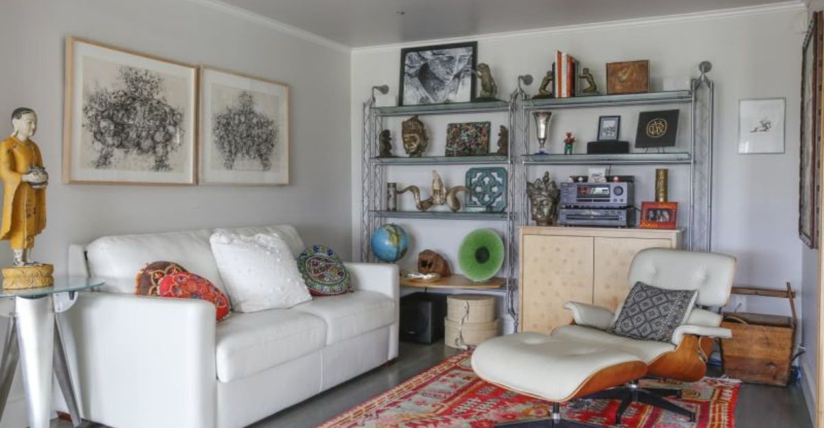
It’s tempting to fall for the age-old design tip that says to maximize floor space, you must line every piece of furniture against the walls. However, it’s a move that kills conversation and spatial flow.
Top designers recommend floating furniture to create cozy zones that invite both interaction and flow of movement. It’s a trick you’ll see in every viral home makeover on YouTube, and for good reason.
8. The Color Catastrophe: When Everything Is the Same Shade
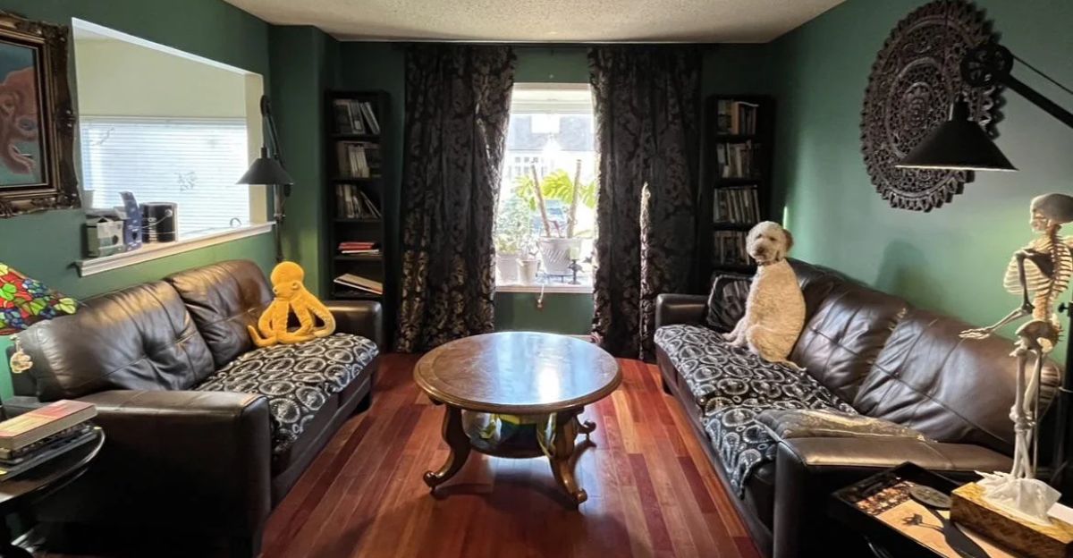
Color soaking, or drenching, means painting the walls, ceilings, and furniture in the same color. It’s actually a popular trend right now and can be chic when done right.
However, it can often come across as boring. To ensure this trick is done right, blend contrast and layer colors for depth. Don’t be afraid to mix it up; even a subtle shift in shade can do wonders.
9. The Trend Trap: Decorating for Instagram, Not for You
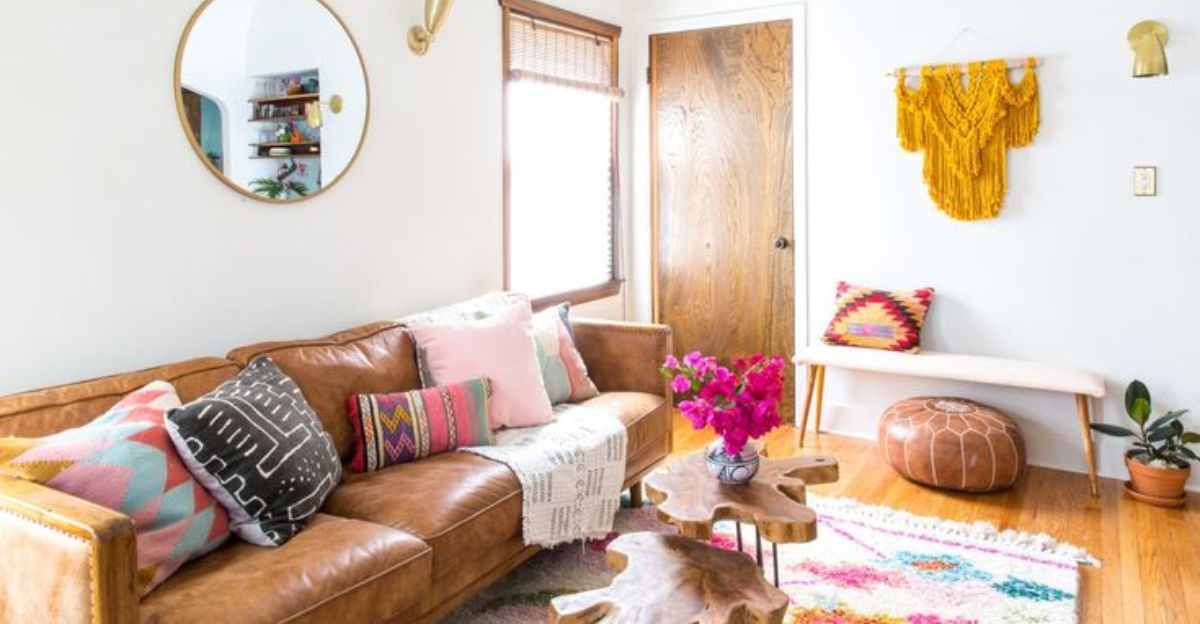
Copying the popular trends sounds like a home décor win, but in reality, it’s a surefire way to create a home that will soon feel dated and entirely unlike you.
Instead, designers recommend using trends as inspiration, not as interior design law. Your house is supposed to reflect who you are, not what’s going viral on social media this month.
10. Curtain Call: Drapes Hung Too Low or Too Short
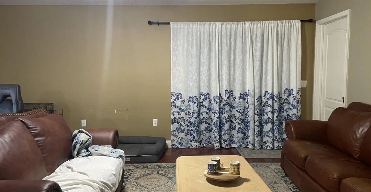
Curtains can make or break a room’s scale. Hanging them just above the window frame or letting them puddle too much on the floor makes the room seem shorter and blocks out light.
The professionally recommended solution? Mount rods high and wide, and let the curtains lightly brush the floor. This simple solution instantly takes the space to the next level.
11. The Forgotten Ceiling: Why the “Fifth Wall” Matters
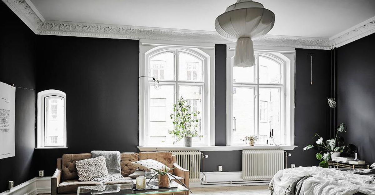
Leaving a blank white ceiling in a boldly colored room is a missed opportunity. Not only does it make the ceiling look and feel lower, but it also leaves the room feeling unfinished.
Designers actually call the ceiling the “fifth wall.” To fix this, try using a complementary or contrasting color for a more cohesive, curated, and personalized look.
12. Skimping Height: Flat Surfaces, Flat Energy
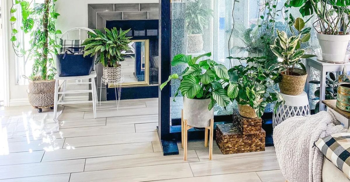
A room where everything is on the same level can feel and look stale and uninteresting, void of personality and visual interest. It’s something people, not just industry experts, will notice immediately.
Therefore, to avoid this, incorporate tall elements—plants, lamps, vases—to draw the eye upwards and create a visual focal point.
13. Sloppy Paint Jobs: When DIY Goes Wrong
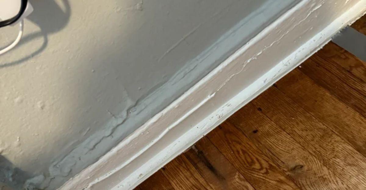
Painting is easy until you see the streaks, crooked edges, or an unsightly sheen reflecting under the lighting. Designers and guests alike can spot a bad paint job immediately, and you will too. If in doubt, hire a professional. No accent wall is worth the regret of a badly painted wall.
14. Forgetting Function: When Beauty Interferes with Living
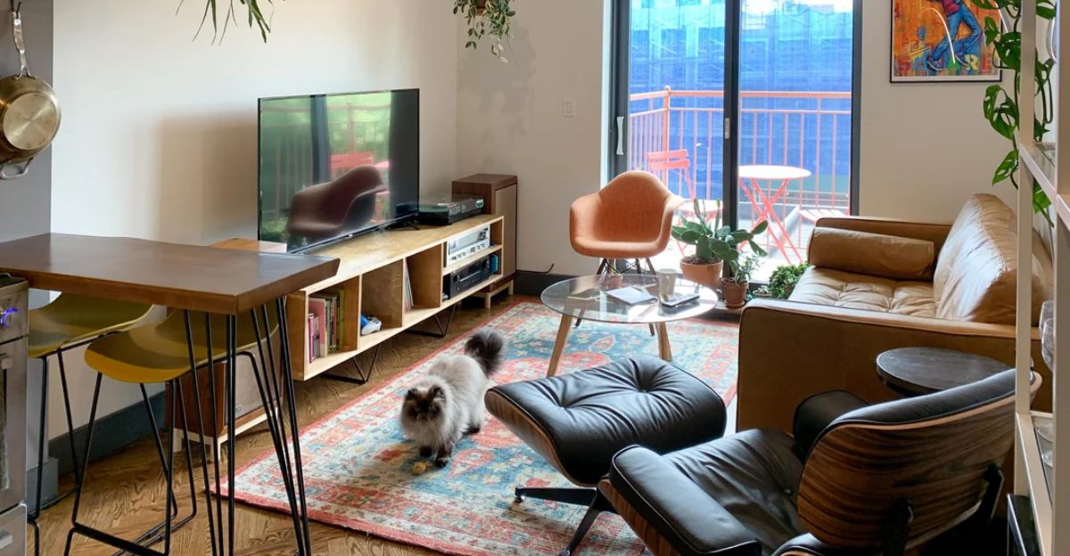
A beautiful room you can’t live in or use properly is not a product of successful design. Industry experts see it all the time—rooms in which function is sacrificed for the sake of high design.
Think: a beautiful sofa you can’t sit on for fear of staining it, or a dining table so big you can’t easily move around it. The most successful rooms are as functional as they are beautiful.
15. Too Much Symmetry: When Balance Becomes Boring
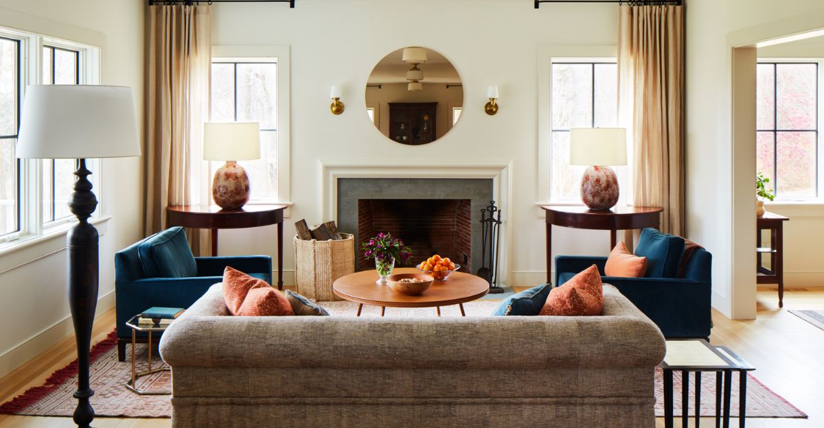
Symmetry is soothing and calming, and it’s a design technique we’d all love to master. However, too much of it can look contrived and lifeless. Most designers love a little asymmetry; therefore, they often recommend a mix of pairs and singles, balanced but not matched. That’s what makes a room feel curated and personalized without looking too cookie-cutter.
Discover more trending stories and Follow us to keep inspiration flowing to your feed!

Craving more home and lifestyle inspiration? Hit Follow to keep the creativity flowing, and let us know your thoughts in the comments below!
Discover more trending stories and Follow us to keep inspiration flowing to your feed!

Craving more home and lifestyle inspiration? Hit Follow to keep the creativity flowing, and let us know your thoughts in the comments below!
