What if the key to a jaw-dropping living room wasn’t a designer sofa or fancy chandelier, but two (or three) perfectly paired colors? Designers all over the world are taking a gamble and combining hues that shouldn’t work—but do.
From sumptuous jewel tones to playful pastels and grounded naturals, let’s look at eight unexpected color combinations that have caught the attention of top interior designers—and are now catching everyone else’s. Some of these are bold. Some are subtle. All are unforgettable.
1. Coffee Brown and Electric Pink
If you believe brown is dull, think again. Designer Suzanne Kasler soaked a Richmond living room in lustrous coffee-brown walls and introduced some bold electric pink flower-shaped accents. The effect? Sophistication with attitude.
A graphic rug and ceiling ground the appearance, while classic Casa Branca upholstery provides comfort. The room is akin to a dense cup of espresso laced with neon syrup—edgy, cozy, and very much alive.
2. Olive, Blood Orange, and Dusty Blue
Summer Thornton’s color choices resemble a painter’s palette. Lacquered olive walls ground the room while blood orange mohair takes center stage. A side chair has never been so theatrical.
Dusty blue and dainty fabric by Décors Barbares are the trifecta that’s equal parts grounding and frivolous. Together, it’s unexpected but tasty—like a Mediterranean spread for the eyes.
3. Sky Blue, Squash Orange, and Coral
It takes Ben Pentreath to make tartan seem downright euphoric. Here, in this snug English sitting room, a squashy orange sofa snuggles up to a coral and blue tartan rug, the whole wrapped in pale sky-blue walls. It shouldn’t work but it sings.
The blue is a visual palate cleanser, preventing the high-octane colors from crashing. It’s a rainbow filtered through a very chic lens.
4. Sunbaked Pink and Midnight
A Mexican hacienda gets a dreamy refresh with pale sun-baked plaster walls—pink but not precious. Laura Kirar grounds the romance with pieces of furniture in deep, almost-black midnight blues.
The tension is peaceful: day and night, sweetness and depth. It’s soft but bold, feminine but earthy. This is the adult pink we never knew we needed.
5. Azul and Claret
If you’re craving elegance, look no further than lacquered azul walls paired with a claret velvet sofa. Miles Redd and David Kaihoi delivered a lesson in opulence with this Virginia living room.
The walls reflect light like liquid glass, while the sofa adds richness and heat. Gold-framed mirrors and artworks play supporting roles in this stage-worthy drama of color and texture.
6. Pea Green and Poppy Reds
Mia Reay resuscitated a Jacobean castle’s Green Hall by embracing—what else—green. Not just any green, however: a spring-like, hopeful pea green from Farrow & Ball.
With bursts of poppy red on curtains, rug, and furniture to follow. The once somber room now breathes with life. It’s the design equivalent of a wildflower meadow in full bloom—unapologetically joyful.
7. Ruby and Deep Chocolate
Designers Andrew Fisher and Jeffry Weisman amped up the drama in their Mexico City apartment with ruby reds and dark chocolate walls.
The double sofas are covered in velvet the color of plump berries, and dark brown walls provide a moody, luxe backdrop to it all. Inspired by artwork, the palette is like an old romance novel—deep, intense, and impossible to ignore.
8. Blue, White, and Wood
Philip Vergeylen’s Casa de Campo getaway demonstrates that you can render a classic color combination not seem cliché.
Blue and white, a tribute to Oscar de la Renta’s porcelain collection, envelope rattan furniture and batik fabric. Natural wood tones add warmth and dimension. This trio does not shout; it calms. It’s timeless without being worn out—a day at the shore in a bottle.
9. Deep Plum and Mossy Light Green
In an Upper East Side townhouse, designer Lucy Doswell combined a tufted deep plum banquette with mossy pale green Holland & Sherry wallpaper.
The effect? A lush yet cozy room. The purple grounds the room, and the green wallcovering provides whimsy and softness. It’s a nice twist on nature: dark flower, light leaf.
10. Teal, Black, and White
Liz Lange’s redesign of Grey Gardens in East Hampton is high-contrast glamour. Teal vintage chairs explode from a subdued black-and-white backdrop, cueing a Matisse-inspired fabric.
It’s a tribute to bold taste—edited, restrained, yet packed with personality. The teal is the exclamation point in a sentence written in elegant black ink.
11. Burnt Red and Light Yellow
Warmth holds court in Palmer Weiss’s California house. Burnt red drapery enfolds the windows like a sunset crystallized in textile.
The supporting cast? Soft yellow pillows and a chair to match that are practically citrus by comparison. The result is sunny and nostalgic, like golden hour on a Tuscan patio. It’s not loud—it glows.
12. Citron and Blue-Black
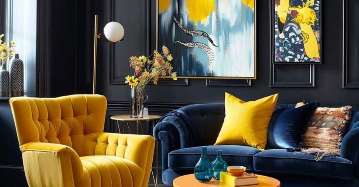
Garrow Kedigian took a cue from the Carlyle Hotel when he furnished his New York apartment. Vibrant citron walls vibrate with energy, and black moldings provide structure and drama.
It’s a lesson in pushing the envelope without falling into anarchy. As lemon zest does in espresso, the acrid burst of yellow cuts the darkness—and the contrast is divine.
13. Monochrome Neutrals—With Depth
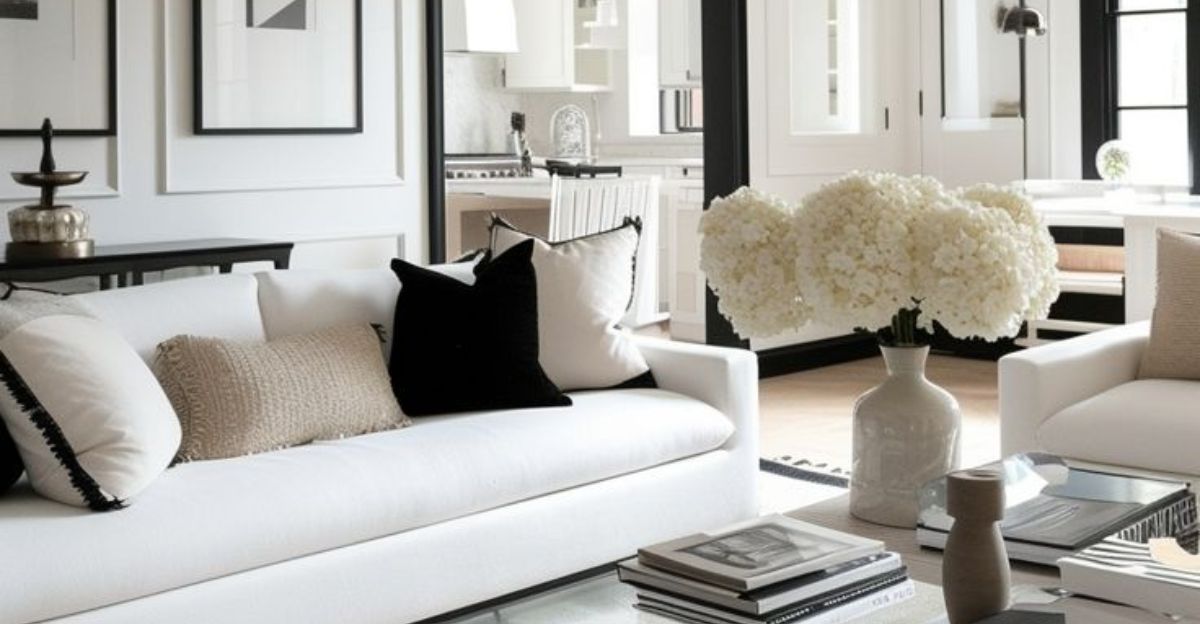
Bobby McAlpine and Susan Ferrier employed a grisaille mural to ground this Naples living room, evidence that neutrals don’t have to be boring.
Beige, taupe, and ivory are mixed with tropical foliage motifs in soft relief. The textures—velvety sofas, natural fibers, layered colors—add depth and movement. It’s the most restrained palette on our list, yet somehow one of the most dynamic.